Wednesday, July 17, 2013

Lux-Update 7-17: Base Textures In!

----------
Since I have been back over the last week or so, I've been able to do alot of experimenting with painting the textures.  Yet again my brother had the critique or, "Keep the Cartoony/Realistic ratio consistent throughout."  One way I implemented that was to keep the fall-off consistent on the color border.  I had the varying gradient to elude to the fur-factor without adding dynamic hair before.  Now I have a painted fur-border to give it the fall-off and fur-factor.  It's barely noticeable from a distance, but on close-ups it really makes it pop.  I have also started to mess with eye-materials.  This is another area I know almost nothing in, so expect it to change.
----------
Speaking of materials, this was completely thrown together as well.  Right now its a Blinn with Diffuse, Spec, and Ambient mapping.  The spec and ambient give it a pseudo-sub-surface, but if I figure out real Mental Ray materials I will most likely use them so that was it looks nice in renders AND in the ViewPort when animating.  Because as animators, we will look at the ViewPort more than we look at the renders.
----------
With all this on Lux now, I think its starting to get its unified look.  And with the exception of Mental-Ray its all pretty much in Maya.  I want this to be easy enough for anyone to download and use, so that is one thing that is causing the constant R&D.

------BUT!  Without further-to-do.... Content:------

(Uploads have been really dark, see the detail pics for good quality)


-----------------------------------------------------


-----------------------------------------------------


-----------------------------------------------------


(I dunno why this one didn't get an alpha, nor did I care enough to investigate)


Tuesday, July 9, 2013

Lux-Update, textures have started!

Hey guys!


So, I thought I would have more time to work on Lux over the past week, but as soon as I got back from Texas, and into the office they told me I was going out to Delaware later that week.  So now I'm here on our last day of this project with a little bit of work I can show.  I unwrapped the puppy over the week, and while I was in Delaware with any kind of downtime, I was working on some files to show you guys.  Point of me mentioning my work situation, is that this is still really early and really rough, so you can keep critiques broad, or let me know what you were looking forward to in the texturing.


Firstly!  Here is the turn around with the wireframe as a texture so you can see how UVs are laid out on the mesh:


And then here are the UV Layouts for both the body and the head --


Head:


Body:


Lemme know what you guys think of the layouts, UV and texturing are not exactly my strongest areas so I will listen to any and all critiques.

Here's the diffuse maps corresponding to the UVs --

Head:

Body:


And now here is the mesh with the diffuse applied to it:


So like I said, this is super early, and this is the first time I've actually looked at the diffuse on Lux with a background different than black.  So with lighter backgrounds I am noticing his face-markings don't pop as well, and I may want to reconsider some of the softer borders of colors. Let me know what you guys think!


~ Jacob Funk, The PreAnimator


Monday, July 1, 2013

Final Mesh! Now time to unwrap!

Hey guys,


These past 2 weeks I haven't been able to put much time into the Lux-Mesh.  But when I did have time I decided to work on Lux's mouth, with his jaws, teeth, and tongue.  When I got back from my trip I worked on connecting it to the existing mesh, as well as polishing some of the edge loops.  I guess the only other noticeable thing I did, was that I shaped the silhouette of his back leg a tad.  I made it look a little bit more extended since its back a bit.  So, unless I get some feedback I hadn't thought of, this thing is DONE!


Lux_Rig: Mesh Turn-Around Version 3 on Vimeo.


I'll let you guys know how the unwrapping goes, its been a while so wish me luck!


~The PreAnimator


Monday, June 17, 2013

Lux-Mesh Version 2, time for MOAR feedback!

Hello, all!


Back again, after a weekend of heavy modeling while waiting by the computer.  I got some critiques from 2 people.  I'm gunna put put a turn-around here first again for you to look at, then wire frames at certain angles, with the critiques that got them where they are, so you can look back at the previous post and see how it changed.


Lux_Rig: Mesh Turn-Around Version 2 on Vimeo.

 Not much from the front, except you can see the new toe structure, ears and eyes have been fleshed out too.  From the side we can see the hip re-work. Previously Scott mentioned he didn't like the nearly vertical edge-loop between his torso and hips.  He though it made it feel to "stuck together".  When I re-worked his groin topologyI kept this in mind, and brought most of the top topology back a bit to give more meaning to the bunching, as well as add flow from his chest, and his legs tucking into his pelvis.  you'll also notice the tail is now fully stretched so it can be rigger.


For the toes, Shannon really liked the under the foot geometry, but if I wanted to hit my cartoony/realistic ratio consistent, I would need to re-work the toes.  We wanted to hit a nice arc in the silhouette of the tops of the toes, i think they look much better.

In the face, I gave the eye socket more definition, and gave the brows more geo, and harder-line below the brow.  The ears now also have some topology to allow it to fold like Luxo's but I have a feeling they will need to through a lot more R&D to get it to look right.  Shannon also mentioned pushing the nose a bit, and gave me some good reference to work with, I think it's alot stronger now.


 I also tightened and maintained the under-the-paw topology.


Please, please, please leave more comments and feedback.  I only got critiques last time, and I already think it's much improved.  So logic would state that the more critiques, the more better it'll be!!!  The topolgy looks pretty solid to me, so besides a little bit of polishing I'll be working on the teeth and tongue, and ear topology unless you guys give me some input!


Thanks again,
The PreAnimator

Thursday, June 13, 2013

First Lux-Rig Update!

Hey All,


Been absent for a long time because of a mix of work and apathy.  I've been working on a couple projects, but most things I can't show, and the other things I haven't felt were up-to-par to show.  So to remedy this, I'm going to try and make a free quadruped-rig, based on my beloved doggy Luxo.  I'm going to be using him both as inspiration and reference, constantly poking and prodding himto figure out how his tiny body is made.  Once this puppy is completed I'll be giving it away for free, and uploading it to several rig sources.


I also want to take the time to make this the best thing I have ever made.  I have been needing to push myself as of late, so this is the perfect opportunity.  This also means that if I want it to be the best, I won't be able to do it by myself.  I'll need input from you guys on what you would like to see in a rig, testing at various stages, and for critiques too.


I'll be making a list of features over the next couple days so you can see what I am planning, and so you can tell me what you would like to have added. But for now I wanted to get you guys a glimpse of the mesh so you know I've been working on it, and to get some critique before pushing the mesh and un-wrapping it.


First we got a turn-around:

Lux_Rig: Mesh Turn-Around Version 1


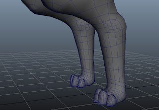
Then here are a few screenshots of the wire-frame on the mesh.


Next step for the mesh is to make the inside of the mouth, the eye socket, and more inner ear.  Once that gets fleshed out I'm going to focus on the areas of deformation more, like shoulder joints and the ears, since Luxo's floppy ears are a major focus of his character.


Please let me know what you think!!!

Saturday, March 17, 2012

Day of Green

Hello people,

I've seen alot of green today, that must mean that today is Dragon Day.  The day where we pay our respects to the great winged green serpents who rule the sky, and our nightmares.  So in order to appease our emerald-overlords I thought I would pot some of the concepts for my new Dragon Rig I'm working on, for now designing.


CHECK IT


If you guys want to chime in on design, do so.  I'm finalizing my design and character sheets this coming week so I can finally start on the thing.


~Jacob Funk, The PreAnimator

Monday, January 23, 2012

End of the January Draw Challenge, beginning of the 2012 Draw Challenge!

Hey peeps,


So, here's the last bits of my January draw challenge I finished the other day.

Day 18:  Memory #3 - GETTING A JOB!

Half sketch / Half style.  I've been working with a rough line style, looks alllmost finished, but has the posh of a finished line.  Not even close to nailing it here, but I'm working on it.  This is about my first time out on trial for my job.  Got on a train to D.C. and as soon as I got there at 2pm, I worked straight through to 2pm the following day... this is how I felt.


This job is awesome, but you'd have to be on 10 kinds of stimulants not to get worn down after the hours we pull.


Day 19: Memory #2 - Trip To LA

Back in January, I was fortunate enough to get selected to go on trip to LA with my fellow animators at Columbia College.  We got to tour a lot of good studios, and when I got DreamWorks something happened I never though would... I got to actually HOLD AND LOOK THROUGH a Nickelodeon Blimp award!!!!  For this went out I was just playing around, and did a pseudo-cut-out thing.  And by that I just tried to make different sloppy layers stand out.


Be jealous.


Day 20: Memory #1 - Haven (Tainted)

This is my number one memory, because honestly it was difficult trying to think of something I did BESIDES Haven in 2011.  Haven spawned from an idea I came up with while listening to the song Tainted by Celldweller the summer before senior year.  I didn't think it would take in the suggestion rounds, but it did and it became my entire classes senior film.  Pretty Awesome.  I think this one is getting closer to what I want my style to be.   Rough-er lines, and a rough-ish paint style inside those lines.  I also took off any softness in the bush and just used a plain circular brush with varying opacity, helped get the strokes noticeable yet looking good.  Let me know what you think.  I'm still practicing my drafting though, because i want to get away from an anime styling or simple shape.  I want more detail and flair.  Please guys I want me some feedback!!!


I always like longer red hair on Kit, and I'll probably to alot more of this character as I progress.


So that's the end of the January draw challenge.  I'm still going to create an image for each day this year, but I'm not going to be posting all of them.  I'll primarily post things I personally like, or things that I want feedback on.  This entire year of drawing and sculpting (yes I just installed the trial of Zbrush so it has begun!!!) is to become better at those things.  And I really can't do that without you guys, so for any post on here I STRONGLY encourage you to critique my work.  Anything aside from "This sucks lol" will be helpful, so don't be worried about sounding too harsh.


Thank you all!
~ Jacob Funk, The PreAnimator